 So, the dice have been tossed, the votes counted, and the influences in high places exerted.
The new name for the new trust is Canal & River Trust. The Welsh name for the new charity is Glandwr Cymru meaning Waterside Wales.
I can see that the names are fitting and representative, if not inspired.
But, frankly, the logo I find very disappointing. I’m a firm advocate of colour not black and white images of our waterways, for colour is what you are stimulated by when you visit the waterways and what makes you want to visit them again. Most people can see the scenes in colour. I am aware of the current black and whte logo and notices, which suggest an historic scene. But this is outdated now and people visit canals for their current beauty not their grey past.
So, why have the consultancy chosen by BW put forward a logo more fitting to a bathroom advertisement?
How much have the powers that be payed for this wonder of modern marketing? How much can the marketing people do to project this using our wonderful new visual technology, so essential to enlist volunteers, encourage paralell business investment, and attract Joe Public to respect and use our precious and irreplaceable asset?
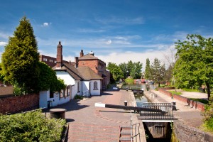
 Why not show the beauty of the canals in fact and in current day living colour as shown on the left and not in a long gone dreary perception above?
I must admit to despair!
For Waterscapes report on this click here.
What do you think?